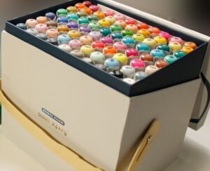
Copic markers are widely considered the gold standard in alcohol-based markers, used by professional illustrators, manga artists, product designers, and hobbyists worldwide. But if you’ve just unboxed your first set, the sheer number of colors, the refillable system, and the dual-tip design can feel overwhelming.
This guide walks you through everything you need to know to start using Copic markers confidently — from understanding the different product lines to mastering fundamental blending techniques that will make your artwork sing.
Understanding Copic Marker Types
Before you uncap a single marker, it helps to understand that Copic isn’t just one marker — it’s a system. There are four distinct product lines, each designed for different workflows and budgets.
Copic Sketch
The Copic Sketch is the most popular model and the one most artists recommend for beginners. It features an oval-shaped barrel that’s comfortable to hold for extended sessions, a Super Brush nib on one end, and a Medium Broad chisel nib on the other. The Super Brush nib is flexible, mimicking a paintbrush, which makes it ideal for organic strokes and blending.
Copic Ciao
The Ciao line is Copic’s entry-level offering. It uses the same ink and color system as the Sketch but comes in a round barrel with a slightly smaller ink capacity. The nibs are identical — Super Brush and Medium Broad. If you’re testing the waters and don’t want to invest heavily upfront, the Ciao is an excellent starting point. The color range is smaller (around 180 colors compared to the Sketch’s 358), but it covers the essentials.
Copic Classic (Original)
The Classic was Copic’s first marker. It has a square barrel, a Fine nib, and a Broad chisel nib. It’s favored by architects, product designers, and anyone who needs precise, straight lines. The square shape prevents it from rolling off desks — a small but meaningful detail when you’re working with expensive tools.
Copic Wide
The Copic Wide is a specialty marker with an extra-broad nib designed for covering large areas quickly. It’s most commonly used in industrial design rendering and large-format illustration. Most beginners won’t need it, but it’s worth knowing it exists.
Which Type Should You Start With?
For most artists, the Copic Sketch is the best starting point. The Super Brush nib is versatile enough for both detail work and broad coverage, and the full 358-color range means you’ll never outgrow the system. If budget is a concern, start with the Copic Ciao — you can always upgrade later since the ink is fully compatible.
Essential Supplies You’ll Need
Copic markers don’t work in isolation. To get the best results, you’ll need a few supporting supplies.
Paper
This is arguably the most important decision after choosing your markers. Copic markers are alcohol-based, which means they will bleed through thin, absorbent paper. You need paper specifically designed for markers or paper that’s heavy enough to resist bleeding.
Recommended options:
- Copic’s own marker paper — Designed specifically for their ink, it delivers smooth blending with no feathering
- Canson XL Marker pad — A more affordable alternative that performs surprisingly well Canson paper review
- Strathmore 400 Series Marker pad — Another solid budget option with good ink resistance
- Bristol board (smooth/plate finish) — Great for precise work, though blending can be slightly different
Avoid standard copy paper, watercolor paper, or textured drawing paper. These will feather, bleed through, and waste your expensive Copic ink.
Colorless Blender (0)
The Copic Colorless Blender (numbered 0) is an essential tool. It contains the same solvent base as Copic ink but without any pigment. You can use it to push color around, create gradients, lighten areas, fix mistakes, and blend transitions. Think of it as an eraser and a brush in one.
Multiliner Pens
If you plan to outline your work before coloring (and most Copic artists do), invest in Copic Multiliner pens. These are pigment-based, waterproof, and — critically — alcohol-proof. Regular ballpoint or gel pen lines will smear and dissolve when you go over them with Copic ink. Copic Multiliners won’t.
A Color Chart
Copic’s color numbering system is logical once you understand it, but at first it seems like a random jumble. Create a hand-swatched color chart on the same paper you plan to use. Colors look different on screen, on the cap, and on paper. A swatch chart becomes your most reliable reference.
Copic’s Color Numbering System Explained
Every Copic color has a code like BV04 or YR68. Here’s how to read it:
- Letter(s): The color family. B = Blue, R = Red, Y = Yellow, BV = Blue-Violet, YR = Yellow-Red, etc.
- First digit: The saturation level, from 0 (most saturated/vivid) to 9 (most gray/muted).
- Second digit: The brightness, from 0 (lightest) to 9 (darkest).
So BV04 is a Blue-Violet that’s very saturated (0) and relatively light (4). YR68 is a Yellow-Red that’s quite muted (6) and dark (8).
There are also special categories:
- 0 (Colorless Blender) — No pigment, solvent only
- 100 (Black) — Pure black
- C, N, T, W — Cool Gray, Neutral Gray, Toner Gray, Warm Gray
Understanding this system helps you pick colors that blend well together. As a rule of thumb, colors within the same letter family and close in their numbering will blend smoothly.
Basic Techniques for Beginners
Laying Down Flat Color
Hold the marker at a slight angle and use the broad side of the chisel nib for large areas, or the brush nib for smaller sections. Work quickly and keep a wet edge — alcohol ink dries fast, and going back over a dried area will create streaks and uneven patches.
Key principle: Speed and consistency matter more than pressure. Let the ink flow naturally from the nib rather than pressing hard.
Flicking
Flicking is a technique where you start with the nib on the paper and quickly pull it away, creating a stroke that goes from full saturation to a feathered edge. This is useful for hair, fur, grass, and any texture that needs organic, tapered lines. The brush nib excels at flicking.
Layering
One of Copic markers’ greatest strengths is layering. Because the ink is alcohol-based, applying a second layer over a dried first layer reactivates the pigment and intensifies the color. You can build up from light to dark gradually, giving you precise control over value.
Pro tip: Always start with your lightest color and build darker. It’s easy to add darkness but nearly impossible to remove it.
Blending Techniques
Blending is where Copic markers truly shine and where most beginners focus their practice.
Feathering
Apply two colors next to each other and use short, overlapping strokes where they meet. The alcohol solvent naturally causes the inks to merge at the boundary. This is the simplest blending method and works well for gentle transitions.
Colorless Blender Method
Lay down your darker color first, then use the Colorless Blender (0) to push the pigment outward, creating a gradient that fades to white. This technique is excellent for highlights, soft edges, and atmospheric effects.
Palette Blending
Touch the lighter marker’s brush nib to the darker marker’s brush nib, allowing some of the darker ink to transfer. Then use the lighter marker on paper — for the first few strokes, it will lay down a blended intermediate color. This creates incredibly smooth transitions.
Back-and-Forth Blending
While the ink is still wet, go back and forth between your two colors at their meeting point. The wet ink allows the solvents to mix on the paper, creating a seamless gradient. Speed is essential — once the ink dries, this technique creates streaks instead of blends.
Working With Skin Tones
Skin tones are one of the most common subjects for Copic artists, and Copic has an extensive range of colors specifically suited for various skin tones. Here’s a simplified approach:
- Base layer: Choose a light, warm tone (E00, E11, or E21 are popular starting points for lighter skin tones; E33, E35, or E37 for medium; E47, E49, or E57 for darker).
- Shadows: Go one or two steps darker within the same family. Apply shadows where natural shadow falls — under the chin, beside the nose, under the hair line.
- Blending: Use your lightest shade or the Colorless Blender to smooth transitions between base and shadow.
- Blush: A light touch of R20 or RV10 on the cheeks, nose tip, and ears adds warmth and liveliness.
The key to natural-looking skin is subtlety. Use fewer layers rather than more, and err on the side of too light rather than too dark.
Maintaining Your Copic Markers
Copic markers are an investment, and proper maintenance ensures they last for years — even decades.
Refilling Ink
One of Copic’s biggest advantages over competitors is that they’re refillable. Copic Various Ink bottles are available in all 358 colors. When your marker runs dry, simply remove the chisel nib with tweezers, drip ink into the barrel (usually 2–3 ml for a Sketch), and replace the nib. One bottle of Various Ink can refill a Sketch marker approximately 9 times.
Replacing Nibs
Nibs wear down over time, especially if you apply heavy pressure. Both the brush and chisel nibs are replaceable. Copic sells replacement nibs in packs, and swapping them takes seconds — just pull out the old one with tweezers and push in the new one.
Storage
Store your markers horizontally. This keeps the ink distributed evenly to both nibs. Vertical storage can cause one end to dry out faster. Keep them away from direct sunlight and heat, which can evaporate the solvent and degrade the ink.
Cap Hygiene
Always recap your markers immediately after use. Alcohol ink evaporates quickly in open air. Even leaving a marker uncapped for a few minutes can dry out the nib. If a nib does dry out slightly, a drop of Colorless Blender solution can reactivate it.
Building Your First Color Palette
Buying all 358 Copic Sketch colors at once would cost well over $2,000. A more practical approach is to start with a curated palette and expand as needed.
Recommended Starter Set (12 Colors)
| Color Code | Color Name | Use Case |
|---|---|---|
| BV31 | Pale Lavender | Light shadows, skies |
| B21 | Baby Blue | Skies, water highlights |
| B37 | Antwerp Blue | Deep blue, water |
| YG03 | Yellow Green | Light foliage |
| G28 | Ocean Green | Dark foliage, shadows |
| Y13 | Lemon Yellow | Highlights, warm accents |
| YR04 | Chrome Orange | Warm objects, sunset |
| R27 | Cadmium Red | Primary red |
| E11 | Barley Beige | Skin base, light surfaces |
| E37 | Sepia | Warm shadows, wood |
| N3 | Neutral Gray No.3 | Light shadows, metal |
| 100 | Black | Outlines, darkest shadows |
This palette gives you a warm and cool option in most color families, a skin tone base, a neutral gray, and black. From here, you can identify which colors you reach for most and expand in those families.
Common Mistakes to Avoid
Learning to use Copic markers involves some trial and error, but you can save yourself frustration by avoiding these common pitfalls:
- Using the wrong paper. This is the number one beginner mistake. Bad paper leads to bleeding, feathering, and streaking — and then you blame the markers. Always use marker-specific paper or smooth bristol. How to choose the right paper for markers
- Going too dark too fast. Start light and layer up. A color that’s too dark can’t be removed, but a color that’s too light can always be darkened.
- Not keeping a wet edge. Alcohol ink dries within seconds. If you let an edge dry before completing your fill, you’ll get visible overlap marks. Work quickly and methodically.
- Pressing too hard. The brush nib is delicate. Heavy pressure splays the fibers and shortens its lifespan. Let the ink flow; the marker does the work.
- Ignoring the color numbering system. Randomly grabbing colors leads to muddy blends. Stay within the same color family and keep saturation/brightness values close for smooth transitions.
- Storing markers vertically with caps up. This drains ink away from the brush nib and leads to dry strokes. Store horizontally, always.
Practice Exercises for Beginners
Exercise 1: Gradient Strips
Choose one color. Draw a rectangle and fill it with even color. Then, using the Colorless Blender, push the color from one end toward the other, creating a gradient from full saturation to white. Repeat with different colors.
Exercise 2: Color Family Blending
Pick three colors in the same family (e.g., B21, B24, B37). Color three adjacent bands and blend where they meet using back-and-forth strokes. The goal is a seamless transition between all three.
Exercise 3: Sphere Shading
Draw a circle. Using three values of the same hue (light, medium, dark), shade the sphere to create a three-dimensional illusion. Place the lightest tone where light hits, the medium in the middle zone, and the darkest in the shadow. Blend the transitions.
Exercise 4: Skin Tone Practice
Draw a simple face outline. Practice the skin tone technique described above — base, shadow, blend, blush. Repeat until the transitions feel natural.
Frequently Asked Questions
Are Copic markers really worth the high price?
For serious artists, yes. Copic markers are refillable, have replaceable nibs, and their ink is formulated for professional-grade consistency and blendability. When you factor in refills, a single Copic marker can last years and deliver thousands of meters of line. Budget markers like Ohuhu and Arrtx have closed the gap significantly, but Copic’s system — ink quality, nib variety, and color consistency — remains the benchmark. Ohuhu vs Copic comparison
What’s the difference between Copic Sketch and Copic Ciao?
Both use the same ink and the same nib types (Super Brush and Medium Broad). The differences are the barrel shape (oval vs. round), ink capacity (Sketch holds more), and color range (Sketch has 358 colors, Ciao has around 180). The Sketch is the professional choice; the Ciao is a more affordable entry point. If you’re just starting out and unsure about committing, begin with Ciao — you can always switch later.
Can I use Copic markers on regular paper?
Technically, yes, but the results will be poor. Standard copy paper is too thin and absorbent. The ink will bleed through to the back (and onto whatever’s underneath), feather at the edges, and resist smooth blending. Always use marker paper, smooth bristol, or another heavy, non-absorbent surface. Best paper for markers guide
How do I fix a mistake with Copic markers?
Alcohol-based ink is difficult to fully erase, but you have options. The Colorless Blender can lighten an area by pushing pigment outward. For more aggressive correction, apply rubbing alcohol (isopropyl, 91% or higher) with a cotton swab to lift pigment. On certain papers, you can also layer white gel pen or white acrylic paint over a mistake. Prevention is the best fix — work light to dark and test colors on scrap paper before committing.
How many Copic markers do I need to start?
A set of 12 well-chosen colors is enough to create a wide range of artwork. Focus on getting one light and one dark shade in each major color family (blue, red, yellow, green), plus skin tones and a neutral gray. As you develop your style, you’ll naturally identify which color families you use most and can expand from there. Many professional artists work with 36 to 72 colors as their core palette.